Case Study
Zilker rebrand
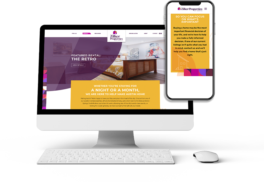
Red Thread Brands created a beautiful and bold rebrand for a fun and warm real estate brokerage with a 35 year history in the heart an iconic “weird” area of Austin. The rebrand speaks to the future of the Austin market while also embodying important aspects of the legacy brand.
Opportunity
Red Thread Brands was invited to help rebrand a successful 35-year old family-owned Austin real estate company, formerly named Kaleidoproperties. The company wanted a brand that was fresh and easier to spell, combined the real estate brokerage and vacation rental parts of their business, and incorporated the existing legacy to help ensure their success in an increasingly high-end Austin market.
Client: Zilker Properties
Industries: Real Estate
Services: brand audit, brand refresh, including business renaming
Name & Storyline
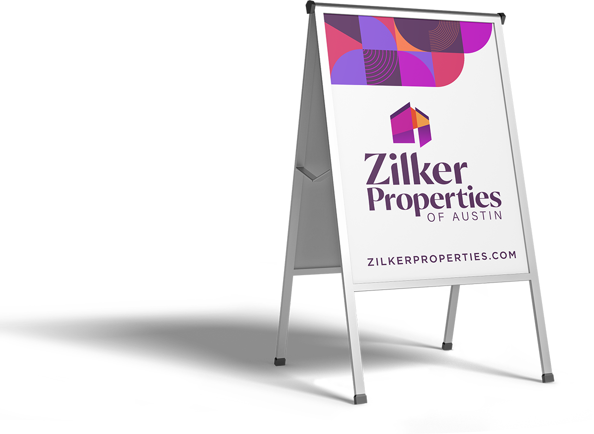
We needed a name that provided a sense of place and was broad enough to incorporate both the buying/selling of homes as well as their established vacation rental business. The name also needed to be easy to spell and pronounce so that return customers would be able to easily find the website and send emails. Since the brokerage is in the Zilker area of Austin and predominantly lists and sells houses in that area, we landed on Zilker Properties of Austin.
For the storyline, we wanted to incorporate the warmth and authenticity of the entire staff as well as the history of the brokerage. The client loved “Making Austin Home for over 35 Years.”
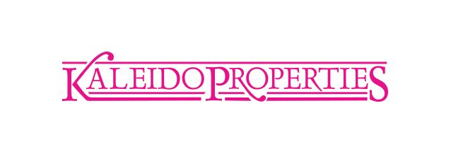
before

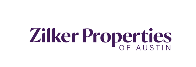
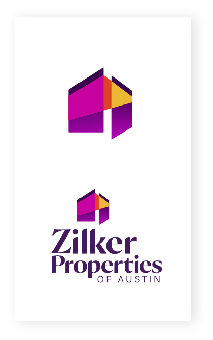
after

Logo Development
The owner of Zilker Properties is a former kaleidoscope maker (thus the former name, Kaleidoproperties) and wanted to incorporate that legacy into the branding, while establishing a mark that would appeal to a high-end buyer. Red Thread Brands designed a logo that resembles a modern structure with clean lines and geometric shapes, but also symbolizes a house with a door opening and warm, inviting light coming out. The typeface is fun and quirky, bringing in just a touch of the “Austin Weird.”
Brand Elements
The previous Kaleidoproperties logo was a bright, flamingo pink with a black and white checkerboard that became a recognizable branding element in the neighborhoods the brokerage serves. The now Zilker Properties wanted to incorporate similar recognizable colors and elements in the rebrand.
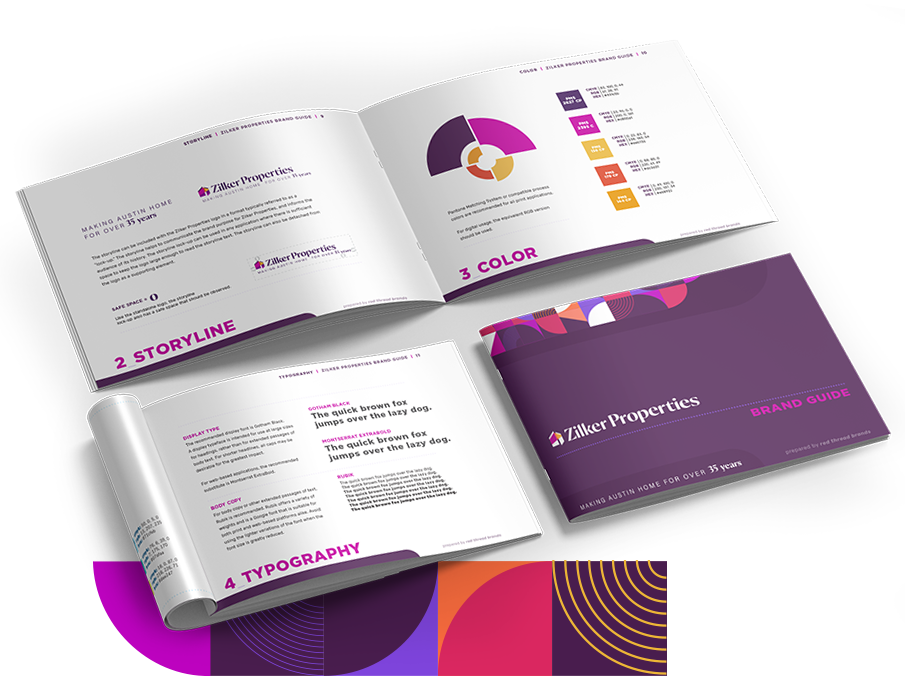
Red Thread utilized a vibrant color palette of berry pinks & purples, bright orange, and eggplant purple to capture the previous vibrancy and again hearken back to the previous kaleidoscopic aspect of the brand. For additional branding elements, Red Thread created a fun geometric block pattern that mimics and expands on the previous checkerboard.
Results
The end result of the Zilker Properties rebranding is a beautiful, vibrant identity that achieves all the requested goals:
- A new, simpler name that establishes a sense of place and allows for both property sales and rentals
- A warm & welcoming logo that can appeal to Austin natives, new transplants, and a growing high-end market
- A vibrant and memorable color palette and branding elements that hint at elements of the legacy brand
- An overall identity that speaks to and incorporates the history in a way that allows the brand to grow into the future.
Marketing is no longer about the stuff you make, but about the stories you tell.
- Seth Godin