Case Study
Brand Development

Red Thread Brands helped MedCapp build a brand that is easy to understand and speaks to diverse audiences to communicate their depth of knowledge in the healthcare billing industry.
Opportunity
Medical reimbursement claims is a specialized and complex field. MedCapp approached Red Thread Brands as a brand new venture, seeking help to build a brand that would convey their deep understanding of the market to all audiences - physicians, hospital administrators, and the claims department.
Client: MedCapp
Industries: Healthcare, Insurance, Tech
Services: brand development
Logo Development
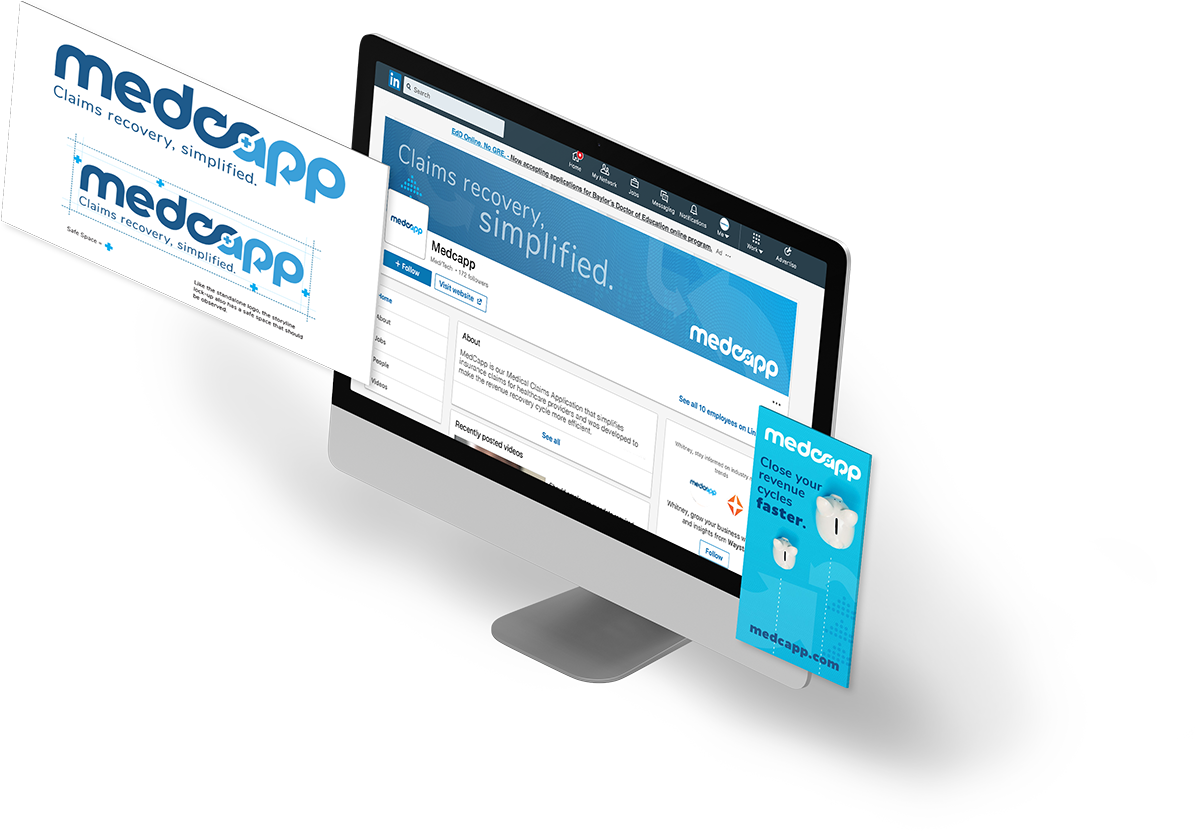
As an online application developed to ease the process of claims appeals, the Medcapp logo needed to integrate both the healthcare and tech aspects of the business. The application was built on a deep legal understanding of the medical claims appeals process, and so we ultimately incorporated that aspect with a modified silcrow, or ‘section sign’ used to reference sections of legal code. When turned horizontally, this symbol also helps indicate the claims recovery lifecycle. Finally, a small medical cross encapsulated in the ‘a’ denotes the medical aspect.

Color Palette
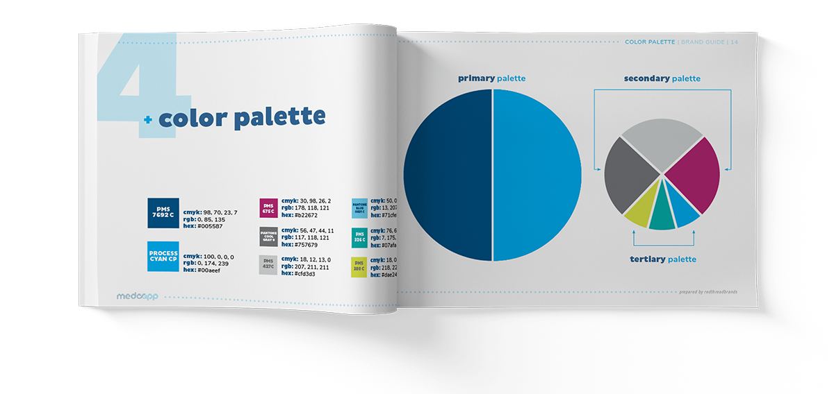
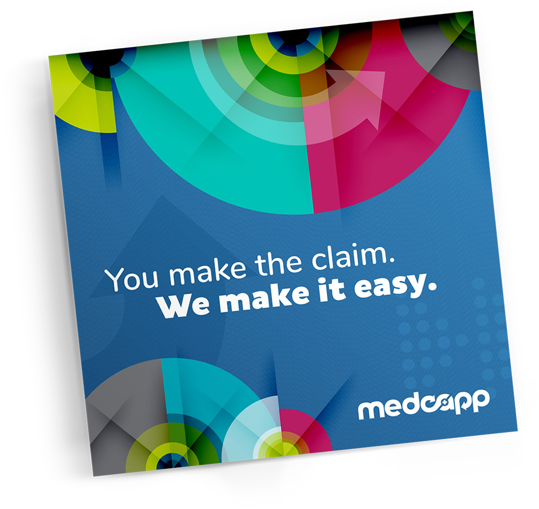
Because MedCapp falls into both the tech and healthcare industries with a background in legal process of claims appeals, we wanted the color palette and visual elements to reflect and make sense to all these industries. The ‘Silcrow Blue’ and ‘Scrub Blue’ tie the color palette to the feelings of trust and reliability required when choosing a partner to help with your revenue cycle, while pops of bright secondary and tertiary colors like magenta and chartreuse keep the palette lively and engaging.

Storyline
While there are other businesses that offer medical billing support, MedCapp is unique in its process for appealing out-of-network claims using a proprietary legal algorithm. It provides healthcare companies with a simplified, less personnel-intensive way to appeal rejected claims and recover more revenue.
The storyline needed to capture this complex process in a way that makes the value that MedCapp brings to the table immediately apparent.

The final storyline, “Claims recovery, simplified” does just that - speaking directly to what the company does that is different from competitors in the market.

Results An identity that checks all the boxes.
- The logo incorporates all aspects of the industries that tie the application together - medical, tech, and legal.
- The color palette speaks to all of the client’s audiences, from the medical or business personnel making the purchasing decision to the billing specialists who will use the tool.
- The storyline quickly and easily communicates the value of the application, indicating the ability to recover the billing claims with a smoother process.
Marketing is no longer about the stuff you make, but about the stories you tell.
- Seth Godin